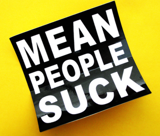
 In what some consider to be the golden era of American advertising, (late 1940’s through late 1960’s), many advertising agencies effectively employed a three-word tagline/slogan model for products and services being advertised. This method became quite popular in both radio and print formats. It is certainly very much in use today.So what makes the idea of saying something in three words so effective? Well, to illustrate this, perhaps we could take a look at some of the everyday examples, when all of us, regardless of our educational and socio-economic backgrounds, find it absolutely, positively necessary to express our ideas simply in three words:- leave me alone
– what’s your problem? (technically it’s four words, but I’ll explain later)
– are you mad? (at times alternated with “are you stupid?”)
– well, well, well…
– check it out Continue reading “You Never Know” or “Linguistic Threesomes”


